Image

Our website guides provide everything you need to manage and enhance your web presence effectively. With resources from Drupal content management system (CMS) account setup, service requests for website updates, CMS training for hands-on support, and photo submission guidelines, you'll have all the tools to keep your site current and engaging.
Request a Drupal Account → (Google Form)
To gain editing access to our website, please request a Drupal account. As a Content Editor, this account will allow you to log in and update content within your designated site sections.
Drupal Content Management System CMS Training → (Google Docs)
Content editors can refer to the CMS training manual for website editing. It provides essential steps and best practices to streamline the editing process.
Photo Submission → (Google Form)
Submit a headshot for inclusion in the faculty and staff directory and your profile pages.
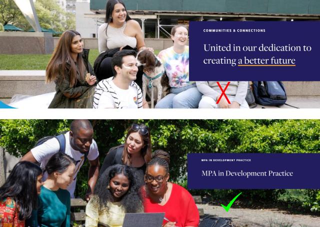
SIPA’s website is powered by the Drupal Content Management System (CMS), offering enhanced flexibility and modularity in its design. Instead of using rigid templates, the site was built with a "building block" approach using customizable elements called “components.” This toolkit provides an outline and explanation of each component available for page design, along with best practices for effective use.
Please refer to the Component Toolkit list above to identify each component and its intended use case.

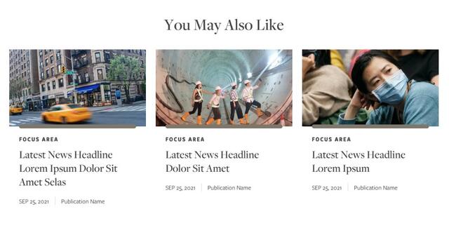
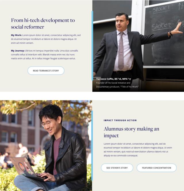
Manual Cards
Article Cards & Manual Cards (Horizontal)
The table below lists commonly used templates (referred to as content types in Drupal), such as Landing Page, Left Nav Page, Article, Event, Capstone, and Microsite with the components available for each.
| Components | Landing | Left Nav | Article | Event | Capstone | Microsite |
|---|---|---|---|---|---|---|
| 50-50 Split CTA |
✓ |
× |
× |
× |
× |
✓ |
| 50-50 Split CTA |
✓ |
× |
× |
× |
× |
✓ |
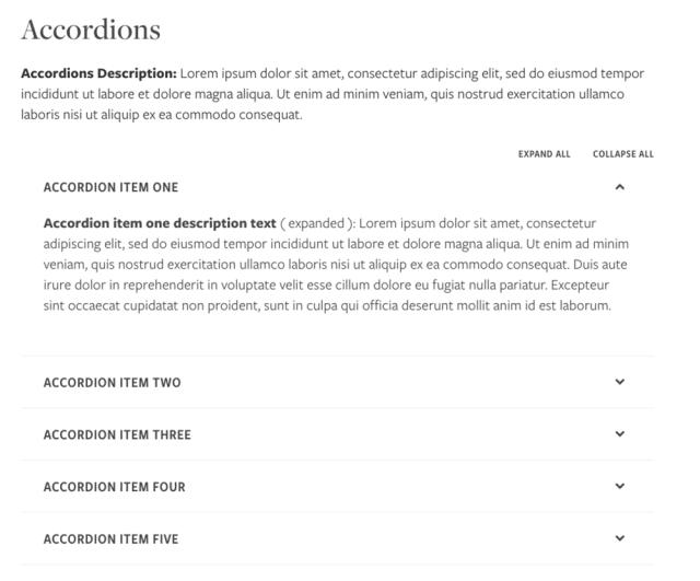
| Accordions |
✓ |
✓ |
✓ |
× |
✓ |
× |
| Article Cards - by Taxonomy |
✓ |
× |
× |
× |
× |
× |
| Article Cards Horizontal - Manual |
✓ |
× |
× |
× |
× |
× |
| Article Cards Horizontal - by Taxonomy |
✓ |
× |
× |
× |
× |
× |
| Article Cards - Manual |
✓ |
× |
× |
× |
× |
× |
| Caption Image + Text |
✓ |
× |
× |
× |
× |
× |
| Chart |
✓ |
✓ |
× |
× |
× |
✓ |
| Collapsible Panel |
✓ |
✓ |
× |
× |
× |
✓ |
| Degree Information |
✓ |
× |
× |
× |
× |
× |
| Enhanced Tabbed Content |
✓ |
✓ |
× |
× |
× |
✓ |
| Event Cards - Manual |
✓ |
× |
× |
× |
× |
× |
| Event Cards - by Taxonomy |
✓ |
× |
× |
× |
× |
× |
| Full Width Image + Text |
✓ |
× |
× |
× |
× |
× |
| Full Width Text + CTA |
✓ |
× |
× |
× |
× |
× |
| Image Gallery |
✓ |
× |
✓ |
× |
× |
× |
| Intro Text |
✓ |
× |
× |
× |
× |
× |
| Link List |
✓ |
× |
× |
× |
× |
× |
| Manual Cards |
✓ |
✓ |
× |
× |
× |
× |
| Manual Cards 2 Up |
× |
✓ |
× |
× |
× |
× |
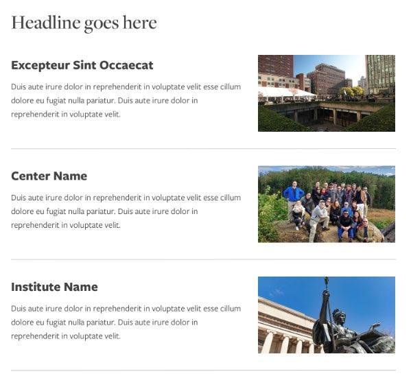
| Manual Cards - Horizontal |
✓ |
✓ |
× |
× |
× |
× |
| Microsite Chapter |
× |
× |
× |
× |
× |
✓ |
| Profile Cards |
× |
✓ |
× |
✓ |
× |
× |
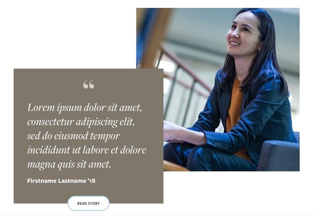
| Quote + CTA |
✓ |
× |
✓ |
× |
× |
× |
| Rich Text |
✓ |
✓ |
✓ |
✓ |
✓ |
× |
| Rich Text 50/50 |
✓ |
× |
× |
× |
× |
✓ |
| Spacer |
✓ |
✓ |
✓ |
× |
✓ |
× |
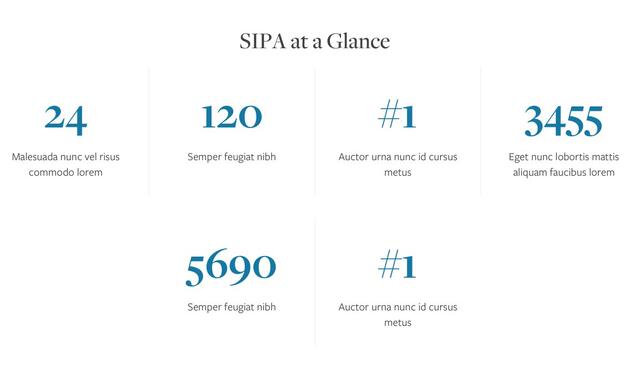
| Stats |
✓ |
✓ |
× |
× |
× |
✓ |
| Text + Images Mosaic |
✓ |
× |
× |
× |
× |
× |
| Thumbnail Checklist |
✓ |
✓ |
× |
× |
× |
× |
| Vertical Tabbed Carousel |
✓ |
× |
× |
× |
× |
× |
| Video with Text |
✓ |
× |
× |
× |
× |
× |
The site design is responsive, meaning that content automatically scales and rearranges for the best possible display based on the user’s screen size. The following table catalogues how images display at the 1200pt desktop view and recommend CMS upload sizes that will ensure crisp images even on retina devices.
| Component | Display Size | Upload Size | Ratio |
|---|---|---|---|
| @1x at 1200pt | Recommended minimum | Responsive | |
| Homepage Hero | 1200 x 500px | 2000 x 1125px | 16:9 Note: Keep subject matter on the left side of the image |
| Landing Page Hero | 1200 x 400px | 2000 x 667px | 3:1 Note: Keep subject matter on the left side of the image |
| 50/50 | 600 x 600px | 1800 x 1800px | 1:1 |
| Find Your Education Link List | 400 x 225px | 1200 x 675px | 16:9 |
| Full Width Text with CTA | 1200 x 400px | 2000 x 667px | 3:1 Note: Use atmospheric, non-specific imagery. Architectural details, statues, campus flora, etc. |
| 3-up Manual Cards | 350 x 197px | 1050 x 560px | 16:9 |
| Featured Events Promo - Primary Featured Events Promo - Secondary | 525 x 296px | 2000 x 1125px | 16:9 |
| Text with Video (poster image) | 700 x 394px | 2000 x 1125px | 16:9 Note: Event Featured Images promote events sitewide. |
| Caption Image w/ Right Hand Rich Text | 300 x 533px | 900 x 1600px | 9:16 |
| Text and Image Mosaic (quote) | 400 x 400px | 1200 x 1200px | 1:1 |
| Full Width Image and CTA | 1200 x 675px | 2000 x 1125px | 16:9 |
| Quote and Image | 600 x 600px | 1800 x 1800px | 1:1 |
| Manual Cards Horizontal | 250 x 140px | 750 x 420px | 16:9 |
| Profile Header | 275 x 275px | 825 x 825px | 1:1 Note: Profile Images promote profiles site-wide. |